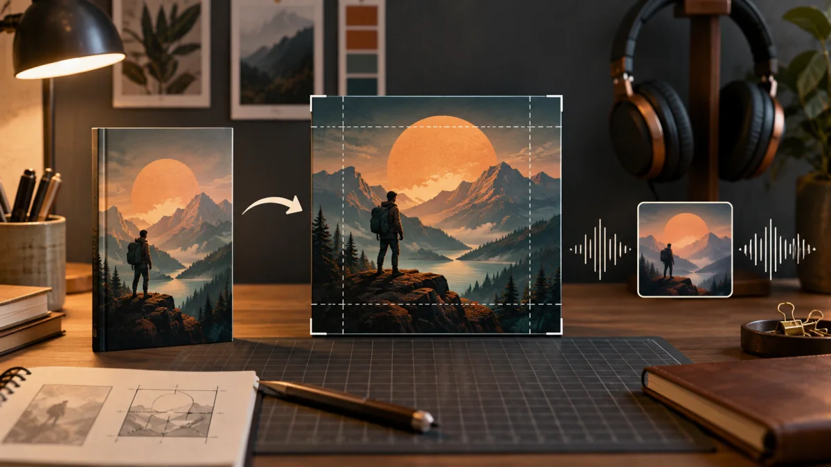
An Audible cover is not a resized paperback front. It is a separate square design that must remain recognizable in search results, library grids, mobile screens, and player interfaces. If you are preparing an audiobook through ACX, getting the canvas right is only the beginning: the title, author name, artwork, and contrast all have to survive the move from a portrait book cover to a compact 1:1 thumbnail.
This guide explains the current Audible cover dimensions, the ACX file rules, and the design workflow for adapting an existing book identity without squeezing, padding, or awkwardly cropping it.
Quick answer ACX currently requires square cover art in a 1:1 ratio, at least 2,400 × 2,400 pixels, in JPG, PNG, or TIF format. The image must be RGB, at least 72 dpi, 24-bit color or higher, and no larger than 8 MB. The title and author name must appear clearly. Check the official ACX cover art requirements again before uploading because platform specifications can change.
Audible Cover Dimensions and File Requirements
For audiobooks submitted through ACX, prepare a file that meets all of these current requirements:
| Requirement | Current ACX specification |
|---|---|
| Shape | Perfect square, 1:1 ratio |
| Minimum dimensions | 2,400 × 2,400 pixels |
| File types | JPG, PNG, or TIF |
| Color mode | RGB, not CMYK |
| Color depth | 24-bit color minimum |
| Resolution metadata | At least 72 dpi |
| Maximum file size | 8 MB |
| Required cover text | Audiobook title and author name |
The pixel dimensions matter more than treating 72 dpi as a design target. A 2,400-pixel square contains the actual image data; the dpi value is metadata that describes how pixels relate to physical measurement. Audiobook artwork is displayed digitally, so there is no trim size, spine, bleed, or print-safe area.
ACX also prohibits barcodes, QR codes, Audible branding, watermarks, prices, running times, website references, and images of physical media. The artwork should fill the square rather than placing a portrait cover inside borders.
Why an Audiobook Cover Is Square
Print and ebook covers are usually portrait rectangles because they represent a page or physical book. Audiobook storefronts and listening apps use square tiles. That shape fits consistent grids and player screens, but it changes how a familiar composition works.
A portrait cover has vertical room for a title above a character, landscape, or object. A square removes much of that height. If you simply crop the top and bottom, you may lose the title or focal point. If you squeeze the portrait into a square, faces and typography become distorted. Adding side borders preserves the original image but fails ACX's requirement that the artwork fill the full square.
Treat the audiobook as another edition with the same visual identity, not the same finished file. For an overview of how formats differ, see Kindle vs. paperback vs. hardcover book covers and the broader book cover dimensions guide.
How to Convert a Book Cover to Audible Format
1. Start with the editable source
Use the layered design file or original artwork when possible. A flattened ebook JPEG gives you little freedom to move the title, separate the subject from the background, or extend scenery into the new square area. Confirm that your artwork and font licenses cover audiobook use before adapting the design.
2. Create a square master canvas
Build a square document at 2,400 × 2,400 pixels or larger in RGB color. Working larger can preserve flexibility, but your final upload still needs to meet the file-size limit. Do not use paperback trim dimensions, a full-wrap PDF, or the portrait dimensions of a Kindle cover.
3. Recompose instead of stretching
Place the main subject where it works naturally inside a square. You may need to reveal more background at the sides, crop closer to the subject, move supporting objects, or use a different crop from the original artwork. Preserve recognizable colors, imagery, and type choices so readers can connect the audio edition with the book.
Never stretch the original cover to fill the square. Distortion is especially obvious in faces, circles, architecture, and letterforms.
4. Rebuild the title hierarchy
Add the title and author as editable text rather than relying on lettering baked into a flattened image. The title should be the first or second thing a viewer notices, depending on the strength of the focal image. A subtitle can remain smaller, but it must not compete with the main title.
Use fewer line breaks where possible, generous spacing, and strong contrast against the artwork. The principles in the book cover font guide still apply: choose genre-appropriate type, limit competing styles, and make the hierarchy deliberate.
5. Protect the lower-right area
ACX says it may add an “Only from Audible” graphic to exclusive titles at its discretion. That treatment occupies the lower-right corner. Even when you do not expect the graphic, avoid placing a face, small subtitle, series number, or other irreplaceable detail there. Use background texture or low-priority artwork in that region instead.
6. Test the cover as a thumbnail
Reduce the design until it resembles a small library tile. Ask three questions:
- Can you read the main title without zooming?
- Is the central image identifiable rather than becoming visual noise?
- Does the cover still signal the correct genre and tone?
Fine textures, thin lettering, long review quotes, and intricate borders often disappear at small sizes. Simplifying the composition usually helps more than sharpening every detail.
7. Export and inspect the final file
Export a square RGB JPG, PNG, or TIF. Confirm its pixel dimensions, color mode, file size, and visual quality after export. Zoom in to check text edges and image detail, then zoom back out for the thumbnail test. Make sure the title and author exactly match the audiobook's credited metadata.
Designing for Audible Thumbnail Readability
An audiobook cover often appears beside many other square covers, so clarity has to happen quickly. A reliable composition usually has one focal image, one dominant title block, and a clearly subordinate author line.
Contrast can come from light against dark, warm against cool, or a quiet area behind the lettering. If artwork is busy, introduce a natural shadow, gradient, or calmer region rather than outlining every letter with heavy effects. Keep enough space around the title that it does not feel trapped by the canvas edge.
Genre signals matter at thumbnail size. A high-contrast typographic treatment may fit a business or self-help title; atmospheric imagery and expressive serif type may suit historical fiction; bold shapes and controlled color may help a thriller. Study current books aimed at the same listener, then build a distinct cover that still feels at home in that category. The fiction cover design guide explains how to research and communicate genre without copying another title.
What to Keep From the Print or Kindle Cover
Keep the visual elements that make the edition recognizable:
- the core artwork or subject;
- the established color palette;
- the title typeface or a close, licensed companion;
- series branding and hierarchy;
- the relative prominence of title and author.
Change whatever depends on the portrait shape. Reposition the subject, rebuild the background, shorten decorative flourishes, and reflow title lines. A matching edition is defined by its system, not by identical pixel placement.
If you are still creating the book's primary visual direction, Cover Studio AI can help you generate or upload artwork and build the Kindle or print edition with editable typography. Keep that high-resolution source artwork and your type choices available, then adapt those assets into a separate square audiobook file. Cover Studio AI does not currently export a dedicated ACX square cover, so the final audiobook composition and specification check should be completed in an image editor.
Common Audible Cover Mistakes
Uploading a portrait cover with borders
ACX requires the artwork to fill the square. Side borders or letterboxing do not turn a portrait design into a square composition.
Cropping out essential information
An automatic center crop may remove the title, author name, or focal subject. Rebuild the layout intentionally on a square canvas.
Using tiny print-cover text
Review quotes, taglines, and long subtitles that fit a paperback may become illegible in an app. Keep only what earns space at thumbnail size.
Adding audiobook-platform branding
Do not place Audible logos or badges on the art. ACX controls any marketplace graphics it applies.
Including a barcode or physical-book mockup
An audiobook cover is a digital square image, not a photograph of a paperback, jewel case, or full book jacket. Remove barcodes and QR codes.
Exporting CMYK or an oversized file
Print workflows often use CMYK and PDF. ACX requires RGB artwork in an accepted image format, with the file no larger than 8 MB.
Audible Cover Preflight Checklist
Before uploading, confirm:
- The canvas is a true 1:1 square and at least 2,400 × 2,400 pixels.
- The file is JPG, PNG, or TIF; RGB; 24-bit color or better; and 8 MB or smaller.
- The title and author name are clear and match the credited metadata.
- The artwork fills the entire square without borders, stretching, or a photographed book jacket.
- No barcode, QR code, price, running time, website, watermark, or platform logo appears.
- Text is sharp, the focal image reads at thumbnail size, and the lower-right corner can tolerate an optional marketplace graphic.
- You reviewed the current official ACX requirements immediately before submission.
Frequently Asked Questions About Audible Cover Dimensions
What size should an Audible cover be?
For ACX, cover art must currently be square and at least 2,400 × 2,400 pixels. It must fill the complete 1:1 canvas rather than using borders around a portrait image.
What file format does ACX accept for cover art?
ACX currently accepts JPG, PNG, and TIF cover files. The image must use RGB color, have at least 24-bit color and 72 dpi metadata, and remain within the 8 MB file-size limit.
Can I use my Kindle cover for Audible?
You can reuse the artwork and visual identity if you hold the necessary rights, but you should not upload the portrait Kindle file unchanged. Recompose the artwork and editable text for a square canvas.
Does an audiobook cover need the narrator's name?
ACX requires the title and author name on the cover. A narrator credit is a design and metadata decision rather than a substitute for either required element. If you include it, keep the hierarchy clear and make sure the credit matches your audiobook information.
Does Audible cover art need bleed or a safe area?
No print bleed is needed because the cover is a digital image, not a trimmed physical product. You should still keep critical content comfortably away from the edges and avoid relying on the lower-right corner because a marketplace graphic may be added there.
Can an Audible cover include a barcode?
No. ACX's current cover rules prohibit barcodes and QR codes. Those elements belong to print distribution workflows, not audiobook cover art.
Build a Square Cover That Still Belongs to the Book
The best audiobook adaptation feels familiar without looking forced. Preserve the imagery, palette, and typography that identify the book, then redesign the composition for the square format and the realities of small-screen browsing. If you need to establish that visual system first, create your book cover with Cover Studio AI, retain your editable source assets, and build the ACX edition as its own carefully checked deliverable.