Authors who self-publish often begin with a single creative concept for their book cover and then face a practical problem: how do you turn that concept into artwork that works for Kindle, for a perfect paperback wrap, and for a hardcover (dust jacket or casewrap) while keeping typography, focal point, and branding consistent? This article gives a format-aware, repeatable workflow that focuses on artwork preparation: image sourcing and retouching, colour and proofing, aspect-ratio and focal-point planning, spine and back-cover treatment, and export rules that protect both thumbnail performance and print quality.
Why format-specific artwork preparation matters
Each edition imposes different constraints. eBook covers are front-only, displayed at thumbnails in stores and on devices. Paperbacks need a full-wrap layout with bleed, correct spine width, a back panel that may include a blurb and barcode, and print-ready CMYK output. Hardcovers introduce new options (casewrap vs dust jacket), different spine proportions, and sometimes special finishes such as foil or embossing that affect artwork placement and file deliverables.
Preparing artwork with those constraints in mind avoids last-minute compromises that can weaken a concept—cropped focal points, unreadable titles on spines, poor colour when converted for print, or an ebook thumbnail that loses emotional impact.
Start with the right master file
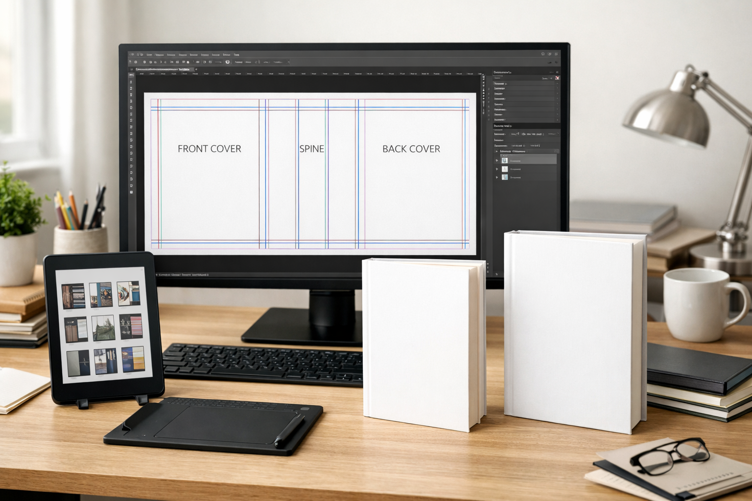
Create a single layered master (PSD, Affinity, or high-resolution layered TIFF) that becomes your canonical source. The master is where you keep original image files, masks, vector shapes, type layers, and notes about intended trim sizes or finishes. Key reasons to use a master file:
- Non-destructive edits: you can resize, crop, or recolour without degrading originals.
- Consistent exports: you derive a Kindle JPG, a paperback full-wrap PDF, and a dust-jacket PDF from the same art so branding and colour remain aligned.
- Production notes and safety layers: keep separate layers that mark trim, bleed, spine lines, and safe zones for export.
Image sourcing and resolution: preserve quality for print and screen
Plan your image resources with final outputs in mind:
- Print (paperback & hardcover): work at 300 ppi at the final printed size. For example, if the front panel prints at 6" × 9", place imagery at 300 ppi for that panel so the print output is sharp.
- eBook (front-only): eReaders and stores use pixel-based images. Export a high-resolution RGB file suitable for the retailer (retailers publish their own pixel guidance). A single high-resolution front image exported as RGB can be scaled down for thumbnails without additional upscaling.
- Always keep original camera/AI images at full resolution in the master. Resize for each deliverable; never upscale compressed final assets.
If your artwork comes from multiple sources—stock photos, author-provided photos, or AI outputs—collect and label original files in the master. Note licensing and attribution where required.
Colour spaces and proofing: RGB vs CMYK
Screen and print use different colour models. eBook covers are produced in RGB and viewed on digital displays. Print presses use CMYK or extended gamut processes.
- Design in RGB while keeping print in mind if you prefer a single working space; convert to CMYK early enough to review how key colours shift. Some deep, saturated RGB colours cannot be reproduced in CMYK and will look duller in print.
- For the print-ready file, convert a flattened copy to the printer’s preferred CMYK profile and inspect areas where colour and contrast are critical (skin tones, skies, dark gradients, type over images).
- Request (or check your printer’s) recommended ICC profile. When printing on different paper types (white, cream, or coated), colours can shift; check proofs whenever possible.
When you can’t get a hard-proof, use on-screen soft-proofing with the appropriate ICC profile and double-check contrast and legibility after conversion.
Plan for different aspect ratios and focal points
One major cause of weak cross-format covers is a composition that only works for one aspect ratio. eBook fronts are often a taller rectangle than the front panel of a printed wrap, and a paperback full-wrap adds back art and a spine. Plan compositions so the visual focal point and the primary title area remain effective after crops and panels are applied.
Work with guides in your master file marking:
- front-only safe area used for ebook thumbnails;
- front panel trim and bleed for print;
- spine boundaries and back-cover safe area.
When composing imagery, keep the main subject inside the smallest safe frame (typically the ebook front panel) so that cropping for different formats never cuts important elements. If you must crop a photo for a paperback wrap, consider retouching or extending backgrounds rather than moving the subject.
Typography and scaling across formats
Typography needs different treatments for thumbnail and print readability. A title that looks dramatic at full size can become illegible at thumbnail scale; conversely, type carefully tuned for thumbnails can look under-designed on a printed cover.
- Build typographic hierarchy in the master using separate layers for title, subtitle, and author name so you can export adjusted copies with weight, spacing, or alignment changes per format.
- For spines, keep type simple and avoid excessive ornamentation. Spine typography must remain legible at narrow widths—see our guide on spine typography for practical rules: Book Spine Typography and Readability for Paperback Authors.
- Test type at thumbnail size early. If the title requires a custom treatment for thumbnails, create a thumbnail-specific export where letterforms are slightly bolder or kerning is adjusted for small sizes.
Spines, back covers, and barcodes
Paperbacks and hardcovers require a full-wrap layout that includes a readable spine and a back panel with space for blurbs and a barcode. A few practical tips:
- Calculate spine width precisely from the final page count and paper stock; small errors shift typography and artwork across the wrap.
- Reserve a clean, high-contrast area for the barcode on the back cover. If you use a white or very light barcode, ensure there is enough contrast with the background to meet scanner requirements.
- When the spine is narrow (e.g., short novellas), consider stacking the author name and title vertically or using a simple mark instead of a full title to maintain readability.
Hardcover-specific considerations: dust jackets vs casewraps and finishes
Hardcovers can be delivered as a casewrap (printed directly on the book board) or as a dust jacket wrapped over the case. Each option requires slightly different artwork preparation:
- Dust jacket: artwork must include flap panels (usually the inner left and right sides) and a top, front, spine, and back with appropriate folds and bleeds. Dust jackets are often printed on coated paper and may use special finishes like spot UV, foil stamping, or embossing. If a foil or emboss will be applied, provide separate art or masks indicating the exact foil/emboss areas and keep vector artwork for linework that must remain crisp.
- Casewrap: typically printed on the board and often uses wrap-safe margins around the edges where the board folds. Casewrap design requires attention to board overlap and sometimes a different set of bleed/safe rules than a dust jacket.
- Finishes (foil, emboss, spot varnish): these usually require additional, production-specific files: a flat artwork file plus a single-channel mask indicating the finished area. Keep those masks in your master file and document any expectations about metallic colour or sheen for the printer.
Because finish requirements vary by manufacturer, confirm exact specifications before preparing final files.
AI-generated artwork and repeatability
If you use AI imagery, plan for reproducibility and access to the original generation steps. Store prompts, seed values (if available), model versions, and any post-generation edits in a notes layer in your master file. For practical advice on producing AI images suitable for covers and iterating toward usable art, see our guide on writing effective AI prompts: How to Write an Effective AI Book-Cover Artwork Prompt.
AI outputs may need retouching to meet print standards (clean seams, remove artifacts, restore fine detail). Treat AI art like any other image source—retain originals and create print-resolution composites.
Exporting deliverables: a format-by-format checklist
Use the master file to export specific outputs. Suggested exports and considerations:
- eBook front image (JPG or PNG, RGB): front-only, highest-quality RGB export that meets retailer pixel recommendations. Keep an export for thumbnail testing and a slightly larger master export for device displays.
- Paperback full-wrap (PDF/X or high-quality PDF): include front, spine, back with correct bleeds, CMYK colour profile as requested by your printer, and a layer with trim/spine guides removed from the final flattened print file. Embed fonts or convert type to outlines when permitted.
- Hardcover dust jacket or casewrap (PDF/X or printer-specified format): include flaps for dust jackets, masks for special finishes if required, and the printer’s ICC profile. Provide separate files for foil/emboss masks as instructed by the manufacturer.
Quality control and preflight checks
Before you upload or send files to a printer or retailer, run a preflight. Don’t rely on a single visual scan—use a repeatable checklist that includes:
- Confirm correct trim size, bleed and spine width against your final page count and chosen paper stock.
- Check image resolution at print size (300 ppi target) and confirm no upscaling artifacts.
- Validate colour conversion to CMYK and review key colour shifts and contrast.
- Ensure type remains legible at thumbnail size and on the printed spine.
- Verify barcode placement and that the quiet zone around the barcode is preserved.
- Review any masks for special finishes and confirm registration expectations with the printer.
- Keep a copy of the final master and all exported files, plus a list of font files and image sources for future edits.
For a formal checklist you can work through before publishing, see our Cover Checker: The Complete Preflight & Market‑Ready Checklist.
File naming, versioning, and documentation
An organised file system saves time on reprints, editions, and localized versions. Use a consistent file-naming convention and keep a small manifest (a plain-text or spreadsheet file) that records:
- master filename and creation date;
- export filenames and intended use (e.g., ebook-KDP-front-3000x4500.jpg, paperback-6x9-300ppi.pdf);
- page count, paper type, and spine width used for exports;
- fonts used (with licensing notes), image sources, and AI prompt log if applicable;
- printer or retailer specifications and ICC profiles used for conversion.
Version your files when you make changes (v1, v2) and archive the versions you send to a printer or upload to a retailer to make it easy to roll back if there’s an issue.
Testing across real-world touchpoints
Before you finalize, test how the cover performs where readers will see it:
- Thumbnail test: view the ebook front at the smallest typical thumbnail size (store library grid, mobile store results) to confirm legibility and impact.
- Device and paper tests: view the ebook image on several devices if possible and review a printed proof to check colour and contrast.
- Shelf and spine test: if you can, print a mock-up (even a low-cost trimmed print) and place it on a shelf or in a stack to see how spine type reads at real scale.
We cover thumbnail testing technique in other guides, but integrated testing during the artwork preparation stage prevents surprises at publication.
Practical workflow summary (step-by-step)
- Create a layered master file with high-resolution originals and guides for front-only safe area, front panel trim, spine, and back panel.
- Compose so the primary focal point fits inside the ebook-safe area; leave margin for spine and back content.
- Design typography as layered elements you can tweak for thumbnails and spines.
- Convert a copy to CMYK early enough to check colour shifts, then produce a print-optimised PDF with the printer’s ICC profile.
- Export high-resolution RGB front image for ebook retailers and a separate thumbnail-optimised JPG for testing.
- Create any additional production masks for foil/emboss and confirm specifications with the printer.
- Run a preflight checklist, test thumbnails and proofs, then archive all final files with a manifest.
Where to go next
This article focuses on artwork preparation across formats. If you need help turning an AI concept into a high-quality master, see: How to Write an Effective AI Book-Cover Artwork Prompt. For a step-by-step preflight you can use before publishing, see: Cover Checker: The Complete Preflight & Market‑Ready Checklist. If you want deeper, practical rules for spine typography, open our spine guide: Book Spine Typography and Readability for Paperback Authors.
Adapting artwork for paperback, hardcover, and ebook editions can feel technical, but a disciplined approach—one master file, format-aware exports, and a short preflight checklist—turns a single creative idea into consistent, production-ready covers that look good on a shelf and in a thumbnail.