The uncovered question
Authors often find a single image, photograph, or motif that perfectly captures their book’s mood or theme. But that same visual might trigger the wrong genre signal in marketplace grids—making readers pick the book up for the wrong reasons or ignore it entirely. This is a design problem that doesn't get as much attention as title placement, thumbnail legibility, or image licensing, yet it matters for discoverability and conversion.
Why this matters
Cover design is a language of signals. Color palettes, focal subjects, typographic treatments, and even image styles (illustration vs. photography) tell potential readers what kind of story or information they can expect. If a cover’s strongest visual cue clashes with the book’s category—say, a pastoral painting for a psychological thriller or a stylised skull on a domestic drama—buyers can be confused, click away, or make a mistaken purchase that leads to returns and poor reviews.
Three common scenarios where the problem appears
- Cross-genre themes: The manuscript blends elements (literary + mystery, romance + speculative), and the image that best represents the text reads as one dominant genre.
- Symbolic vs. literal imagery: A symbolic object (a broken compass, a red thread) carries the book’s theme but reads like genre artwork used by another market.
- Audience expectations vs. author preference: The author prefers subtle or atypical art, while the target audience expects clear genre signals to guide buying decisions.
A practical decision framework
Before abandoning a strong visual idea, run it through this framework to make a practical choice.
- Define the primary commercial goal. Is your immediate objective discoverability in a crowded category, long-term author branding, or a festival/press submission? If discoverability is priority, favour clear genre signals.
- Map buyer expectation gaps. List the top visual cues your target readers use to identify the genre (color, subject, typography, layout). Compare them to your image and note mismatches.
- Estimate the risk tolerance. How niche is your audience? Niche audiences accept unusual covers more readily; broad-market genres (romance, thriller, cozy mystery) tolerate less deviation.
- Consider metadata and positioning fixes. Can keywords, category choices, subtitle, and blurb compensate if the cover leans the wrong way?
- Plan a testing runway. If you keep the image, test thumbnails, A/B ads, and small-market rollouts before wide release.
Visual strategies to keep the image but correct the signal
If the decision is to keep your chosen image, use the design system around it to nudge reader perception back toward the intended genre.
1. Typographic treatment
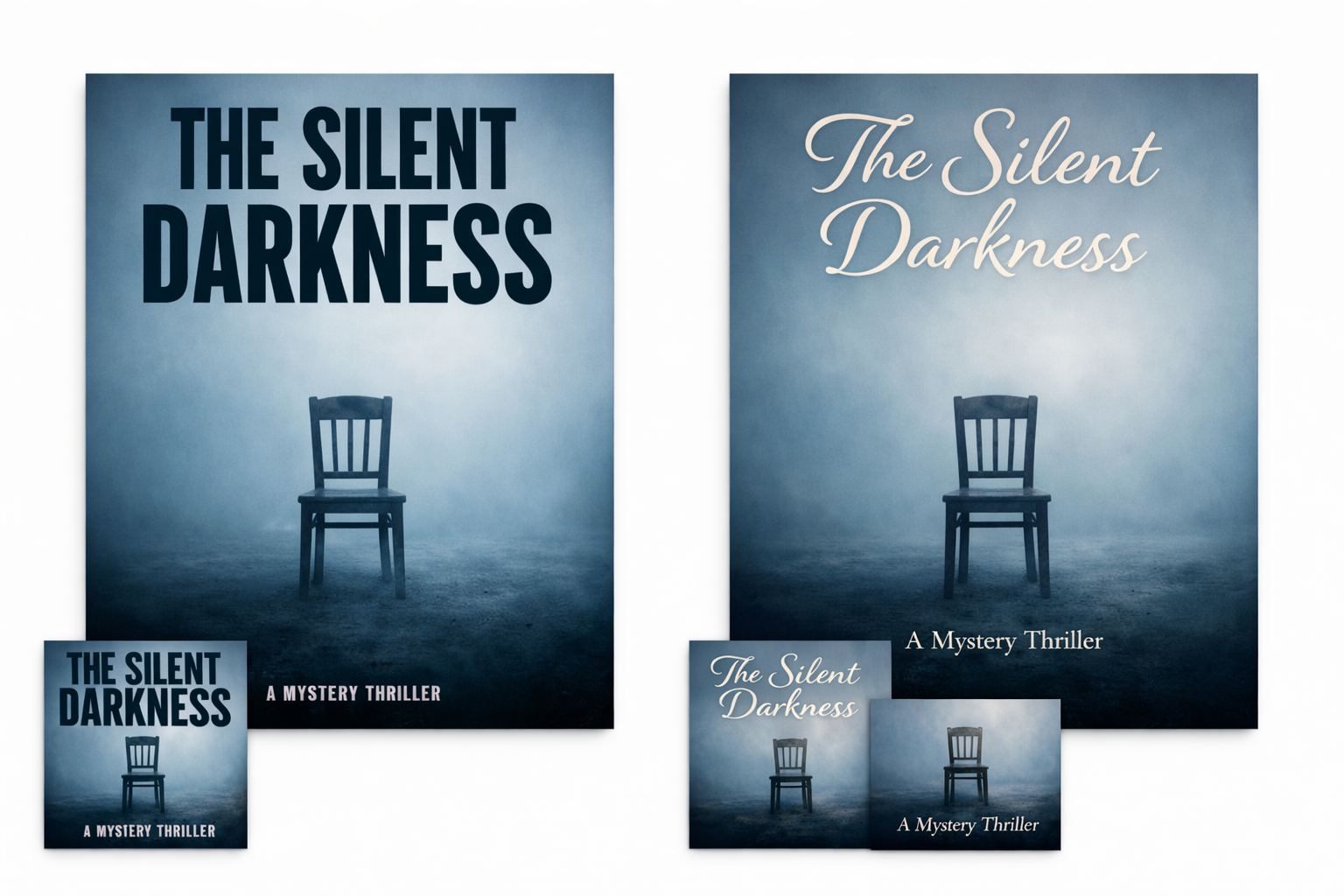
- Choose genre-appropriate fonts for title and author name. A thriller can use condensed sans or bold slab; romance often benefits from soft serifs or elegant scripts. Typography is one of the fastest ways to correct a misleading image.
- Adjust hierarchy and size: a large, bold title often pushes a cover toward commercial categories; smaller, muted titles read more literary. Use this intentionally.
2. Color grading and palette
- Color casts alter mood quickly: cool blue tones read suspenseful or speculative; warm, saturated colors read commercial romance or women’s fiction. Consider recolouring or tinting the image to align with genre expectations.
- Use accent colors for callouts or subtitle bars that echo typical genre palettes while leaving the image largely intact.
3. Layout and compositional anchors
- Add or remove secondary elements that clarify intent: a small weapon, a city skyline, or an office chair can tilt perception toward thriller, urban fantasy, or contemporary fiction respectively.
- Framing and crop matter. A tight, face-forward crop often reads as character-driven fiction; a wide environmental crop can suggest literary or ambient stories.
4. Photography style vs. illustration
- Convert or slightly stylise photographs (duotone, grain, painterly filters) to match genre conventions. Illustrations can be tuned by line weight, texture, and detail level to align with expectation.
Marketplace and metadata fixes that help
Design alone won’t solve every mis-sign. Use metadata and market-facing text to reinforce the correct category.
- Subtitle and tagline: Add an explicit tag like “A Psychological Thriller” or “A Contemporary Romance” when appropriate. Subtitles are visible in many retailers and reduce ambiguity.
- Category choices and keywords: Place the book in the most relevant categories and use clear, audience-facing keywords. Proper categorisation reduces reliance on visual signals alone.
- Blurb and author positioning: Open your blurb with genre markers (“When Detective Jane…”, “A small-town romance about…”) to quickly set reader expectations.
Briefing language for designers and AI
When you brief a designer, freelancer, or AI generator, precise language steers the outcome. Use both the emotional/cultural cues you want and a short list of signals to avoid.
Example brief template:
"Primary image: [describe your chosen image]. Tone: moody and intimate. Genre signal goal: contemporary psychological thriller. Please treat title typography as bold, condensed sans (examples: [font names]) to push toward thriller; avoid pastel palettes, hand-drawn hearts, or script fonts that signal romance. Consider a cool blue-green color cast and a tight crop on the protagonist’s face. Keep the image intact but add a subtle city skyline silhouette in the lower third. Provide two variants: one with a stronger typographic treatment and one with an added secondary element (weapon or evidence) for testing."
This mixes "do" and "don't" instructions so designers/AI know what to protect and what to change.
Testing workflow (quick, low-cost checks before launch)
Testing reduces the risk of mis-signalling. Use the following steps in order:
- Thumbnail check: Shrink the cover to typical ebook and audiobook thumbnail sizes and verify readability of title and presence of genre cues. Use the testing protocol in this guide for best practices: How to Test Whether a Book Cover Works at Thumbnail Size.
- Gallery A/B tests: Run lightweight image tests on social ad platforms or reader groups. Present the cover alongside a version where typographic or color fixes have been applied and compare clickthrough or interest signals.
- Genre-blind micro-surveys: Show the cover image without title or author to a mix of readers and ask: "What genre would you expect?" Use short-answer or multiple-choice to capture perception.
- Small-market rollouts: For print, you can test special runs (author copies, limited giveaways) and watch pre-order behavior or reader feedback before committing to mass distribution.
When a variant cover is the right answer
Sometimes the best path is multiple covers rather than forcing one image to do every job.
- Market-specific variants: Use one cover for broad retail channels and a different cover for specialist stores, festivals, or direct sales. This protects discoverability while preserving your preferred art for audiences who will appreciate it.
- Special editions: Reserve the preferred, unconventional image for special editions, hardcovers, or promotional bundles where context (author note, essay, or introduction) reduces the risk of mis-signing.
- Localized variants: Some markets and languages have distinct genre conventions—consider localised covers when selling internationally.
Checklist before you commit
- Have you defined the primary commercial goal and audience?
- Have you mapped the top three visual cues your audience uses to find books like yours?
- Can typography, color, and layout be adjusted to correct mismatches while keeping the image?
- Did you prepare a clear brief with "do" and "don't" signals for your designer or AI generator?
- Have you run a thumbnail test and at least one quick A/B or micro-survey?
- Is a variant cover or special edition a feasible fallback if tests show mis-signalling?
- Did you align metadata (subtitle, categories, keywords) with the cover to reduce buyer confusion?
Practical examples (how to apply the framework)
Below are anonymised scenarios and mitigation strategies you can adapt.
Scenario A — A literary novel with a gothic photograph
Problem: The photograph reads like horror and might direct thriller readers to the book. Fixes: desaturate and cool the image slightly, use a restrained serif for the title, add a subtitle line that flags "literary novel," and keep the cover for special editions while offering a more neutral front for mass retail.
Scenario B — A romance with a moody, symbolic object
Problem: A symbolic object (a lone chair) reads as literary or women’s fiction rather than romance. Fixes: introduce softer, warmer palettes, add a small illustrative flourish suggesting relationship (interlocking rings, hands), and use a script or elegant serif for the title to signal romance conventions.
Scenario C — A speculative thriller with pastoral art
Problem: Pastoral imagery signals literary or historical fiction. Fixes: increase contrast, add neon accent color to suggest speculative elements, use bold, geometric types, and include a small visual cue (a looming structure, a tech artefact) to nudge perception.
When to walk away from the image
Keeping a problematic image is not always the best choice. Consider abandoning it if:
- Tests show consistent miscategorisation among target readers.
- The image is likely to drive returns or bad reviews because readers bought expecting another genre.
- You need strong discoverability immediately (preorders, algorithmic visibility) and can't afford split audience signals.
Resources and further reading
Use these practical Cover Studio AI guides to support the process:
- How to Build a Visual Brief for a Professional Book Cover — use the visual-brief examples when writing the "do/don't" section of your brief.
- How to Test Whether a Book Cover Works at Thumbnail Size — confirm your corrected cover reads in real-world thumbnails.
- Book cover image licensing: key questions — if you pivot to a new image, verify commercial rights and releases before purchase or generation.
Final checklist: a practical launch plan
- Decide: keep and adjust, use variants, or replace the image.
- Prepare a brief with explicit typographic, color, and "avoid" instructions (use the template above).
- Produce two strong variants: one tuned for discoverability, one tuned for authorial intent or special editions.
- Run thumbnail and micro A/B tests; gather reader perceptions about genre.
- Adjust metadata (subtitle, categories, keywords) to reinforce the intended genre.
- Commit to a rollout: retail cover first for mass channels, special edition later if keeping the original art.
Closing note
Powerful images are tempting because they contain a book’s emotional truth. The trick for self-publishing authors is to balance that truth with clear signals buyers use to decide. Use the visual and metadata levers above, test early, and keep variant covers in your toolkit so the best-looking art doesn’t cost you discoverability.