Why this question matters
Many authors rely on a single, memorable image to sell their book. But sometimes that image is the plot — the dead body behind the curtains, the revealing prop on the hero’s shelf, the recognizable face of a character whose identity is the story’s turning point. Revealing it on the cover can undercut the reader’s experience. Hiding it, however, risks producing a cover that looks generic and fails to attract clicks.
This article gives a practical, non‑technical workflow you can use the next time your strongest visual hook is also a spoiler. It shows how to decide what to show, how to brief a designer or an AI tool, how to test for thumbnails and licensing, and how to plan staged reveals or safe redesigns after launch.
A simple decision framework (3 questions that decide the cover strategy)
- Who is the primary buyer? If your core audience is readers who buy by author or series (established fans), covers can be quieter. If you need to win discovery on retailer grids or ad thumbnails, the cover must communicate genre and promise quickly.
- How fragile is the reading experience? Would revealing this image reduce enjoyment for most readers, or only for a subset? If it ruins a core twist for nearly everyone, err on the side of subtlety.
- Can the hook be signalled indirectly? Ask whether color, texture, a prop detail, or typography can promise the same mood or stakes without showing the spoiler directly.
Answer these three questions first. They determine whether you should show, hide, or hint.
Seven cover patterns for plot‑sensitive books (with pros and cons)
Below are practical cover approaches that let you market a book without spoiling the plot. Pick one based on the framework above.
1) Symbolism and motif
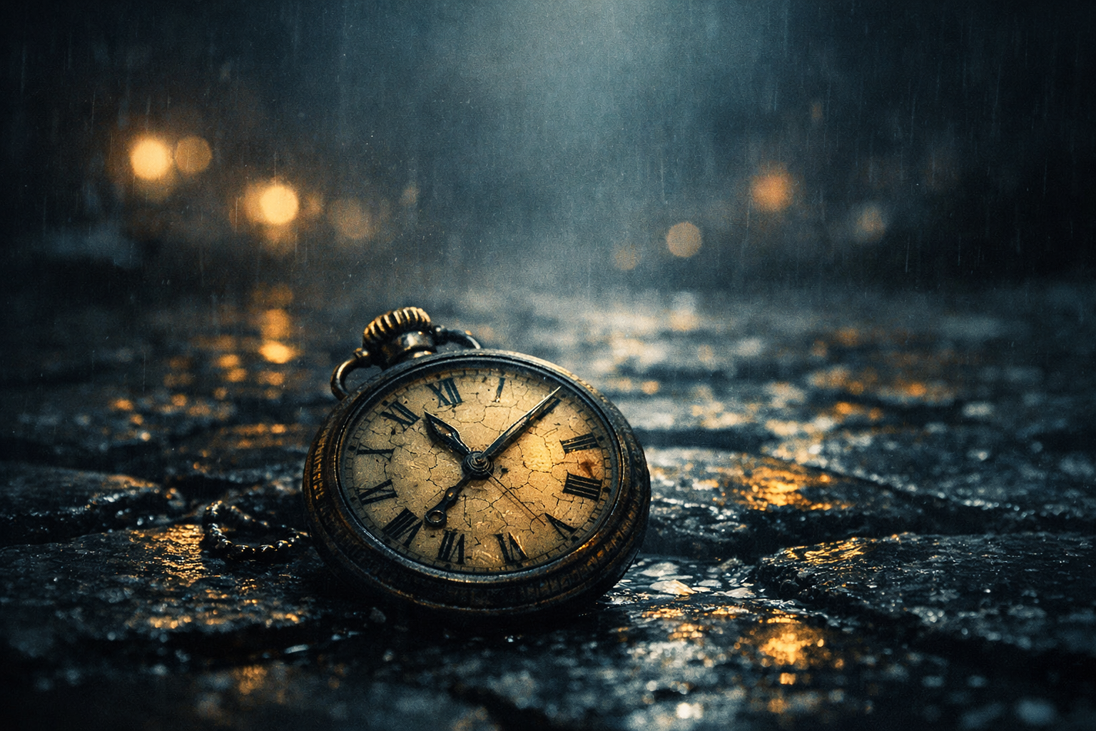
Use a meaningful object or symbol associated with the story (a cracked watch, a folded letter, a single shoe) but avoid the precise scene that contains the twist.
- Pros: communicates theme, preserves mystery, works well at thumbnail sizes.
- Cons: needs a strong, recognizable motif and a short visual explanation in metadata or blurb.
2) Mood-driven environmental image
Use lighting, weather, and composition to set tone (foggy streets, a room lit by one lamp) without showing faces or key plot elements.
- Pros: reliable genre signals, flexible for series branding.
- Cons: can feel generic unless combined with strong typography or a unique color palette.
3) Close-up crop or abstract detail
Zoom in on a texture or fragment of the spoiler (a blood-stained hem cropped to only show pattern, a close-up of hands) so the image reads as texture rather than revelation.
- Pros: intriguing, keeps mystery, performs well on thumbnails.
- Cons: may confuse readers if the detail lacks context—combine with clear title typography.
4) Silhouette or obscured figure
Present a character in silhouette, reflection, or behind glass to imply a person without revealing identity.
- Pros: conveys character presence but protects identity; good for thrillers and suspense.
- Cons: overused in some genres—pair with bold typography or color to stand out.
5) Typography-first cover
Let type carry the weight. Use title treatment, texture, and hierarchy to sell the premise when imagery would spoil the plot.
- Pros: excellent for short, punchy titles and nonliteral stories; great thumbnail clarity.
- Cons: needs a strong typographic solution and genre-appropriate treatments.
6) Double-meaning composition
Design an image that reads differently at different distances: at thumbnail it suggests one idea (genre/mood); at larger size it reveals an ambiguous detail that still avoids spoilers.
- Pros: clever and rewarding for attentive buyers; encourages clicks for larger previews.
- Cons: requires careful testing to avoid accidental reveal when retailers show larger images.
7) Two-stage reveal and edition management
Use a safe front cover for first editions and reserve a reveal version for limited paperback runs, special editions, or marketing assets (book trailers, social posts) labeled as “spoiler content.”
- Pros: protects readers while allowing you to leverage the spoiler later for promotion.
- Cons: must be managed carefully across retailers and metadata to avoid accidental leaks.
Practical checks and tests (don’t skip these)
- Thumbnail test: Ensure the cover communicates genre and legibility at typical ad and store sizes (60–200 px). Test thumbnails on real retailer mockups and social ad sizes.
- Preview-size reveal risk: Check how the image looks at preview sizes retailers use for hover or zoom views. A spoiler can be hidden in thumbnail but revealed in zoom; test both.
- Metadata alignment: Use the book description and category tags to reinforce the promise your cover implies. If the cover is subtle, the blurb must be specific and attention‑grabbing.
- Legal and licensing check: If you use stock imagery or generated artwork, verify commercial and editorial license terms. If a purchased image ties directly to a plot element, consider exclusivity or rights that allow future merchandising. See "Book cover image licensing: key questions" for the right questions to ask.
How to brief a designer (or a cover studio) when you must protect the plot
Don’t assume “don’t spoil the plot” is enough. Give actionable, specific constraints and creative direction. Use these checklist items in your brief or visual brief:
- One-line forbidden list: “Do not display [character name], [specific object], [scene location].” Be specific about what visually counts as a reveal (e.g., “no clear facial features,” “no full-body shot of the protagonist”) .
- Desired signals: “Must read as psychological thriller, use cool tones, single-point lighting, and high contrast.”
- Allowed motifs: “You may use a cracked watch, ink-stained paper, door-knob reflection, or silhouette.”
- Thumbnail goals: “Title must be legible at 80 px; the cover must read as ‘psychological thriller’ at thumb size.”
- Secondary uses: “Design should work as ebook thumbnail, paperback front, and social header. Reserve the back cover for blurb and a low-key author bio.”
- Revision policy: “I want two initial concepts—one symbolic, one mood-based—with up to three rounds of revisions and one alternate reveal cover for limited use.”
Concrete language prevents accidental reveals and speeds up revisions. If you use a cover tool or AI, include the same constraints in the prompt (see sample prompts below).
Sample visual brief snippet (copy and adapt)
Project: Front-only ebook & paperback front
Avoid: No faces, no identifiable characters, no scene from Chapter 12 (the reveal scene). Do not show the antique locket or the window with the curtain.
Use: Mood-driven image hinting at secrecy—fog, narrow corridor, hands in shadow, or a single object close-up (watch, folded note). Palette: desaturated blues and charcoal, accent warm gold. Typography: heavy sans for title, small caps for author name. Legibility: Title readable at 80 px.
Deliverables: JPG 3000×4500 px (ebook), printable front for 6×9 with 300 DPI source and layered PSD.
AI prompt examples that avoid spoilers
If you use generative tools, prompts must forbid revealing features as clearly as a designer brief. Below are two starter prompts you can adapt. They deliberately ban specific elements.
Prompt A (symbolic): “Create a moody, book-cover image for a psychological thriller. Show a close-up of a cracked brass pocket watch laying on rain‑wet cobblestones, heavy desaturation, cinematic shallow depth of field, cool blue tones, no faces, no bodies, avoid showing any recognizable interior scene or specific chapter location, high contrast, space in top-third for large title text.”

Prompt B (mood-based): “Cover image: narrow hallway lit by single overhead bulb, deep shadows, a silhouette at the far end where details are obscured; color palette charcoal and muted teal, cinematic grain, no clear facial features, do not include the antique locket or curtain from chapter twelve, leave clean space for title.”
When using generated images, run the same thumbnail and preview tests—generated art can accidentally include revealing details when upscaled or cropped.
Thumbnail and preview testing routine (quick protocol)
- Export a front-cover JPG at the tool’s recommended resolution.
- Create thumbnails at 60 px, 120 px, and 200 px wide and validate legibility and genre signal.
- Simulate retailer zoom by cropping or upscaling to the larger preview sizes used by your target store—verify nothing revealing appears.
- Run a clarity test on mobile: view thumbnails on an actual phone and in an ad mockup—what reads identical to the screenshot is what buyers see in the wild.
Back-cover and blurbs: a safe place for clarity
If the front cover must be coy, the back cover and blurb can be explicit. Use the back cover and the product description to:
- Make the premise and stakes clear so browsers who click through understand what they’re buying.
- Include bold category keywords the front cover doesn’t have (e.g., “domestic thriller,” “historical mystery”).
- Reserve a short, spoiler-free tagline on the front that promises the central conflict.
When to redesign (and how to stage a reveal)
Consider a redesign if initial sales and feedback suggest the cover isn’t signaling genre or promise adequately. A staged approach can protect readers while still rewarding curiosity:
- Launch with the spoiler-safe front cover and promote it with genre-accurate audience targeting.
- After a set timeframe or sales milestone, release a special edition, paperback, or signed edition with the reveal cover clearly labeled “special edition — contains spoilers” and used in controlled marketing (email list, social posts with warnings).
- Use reveal assets (video, social carousel) labeled with clear spoiler notices to avoid accidental exposure for new readers.
Licensing and image rights—don’t assume safety
Choosing a non-spoiler image doesn’t remove licensing risks. If you buy stock photography or commission art for a motif that later becomes a merchandising asset, confirm commercial rights and any exclusivity you need. For detailed licensing questions and a checklist you should run before buying or generating artwork, see: Book cover image licensing: key questions self‑publishing authors should ask.
Cross-references: useful further reading
- How to Build a Visual Brief for a Professional Book Cover — use the brief templates there and include the spoiler constraints from this guide.
- How to Test Whether a Book Cover Works at Thumbnail Size — follow the thumbnail protocol in that article after you create a spoiler-safe concept.
Final checklist before you publish
- Have you answered the three decision questions (audience, fragility, indirect signalling)?
- Did you give the designer clear forbidden elements and allowed motifs?
- Does the cover communicate genre and promise at 80 px thumbnail size?
- Does the preview/zoom view reveal anything you intended to hide?
- Are image licenses and commercial rights verified for all assets?
- Is the blurb and metadata explicit enough to convert clicks into sales?
- Do you have a staged-reveal plan if you want to use the spoiler later?
Protecting a plot and selling a book are both design problems. With clear constraints, a focused brief, and a routine of thumbnail and preview checks, you can keep the story intact while still producing a cover that finds and converts readers. If you want a place to start, adapt the brief templates in How to Build a Visual Brief and run the thumbnail checks described in How to Test Whether a Book Cover Works at Thumbnail Size.