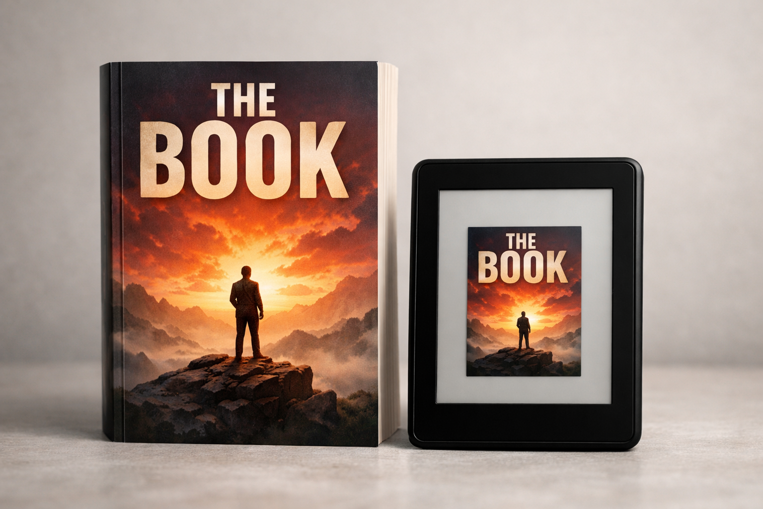
What self‑publishers mean by “covertitle”
When authors search for covertitle they’re usually trying to solve one or more of these problems: what wording to put on the front, how large the title should be, how the title works with a subtitle and author name, and whether the title will still read at thumbnail size or on a bookstore shelf. This article focuses on practical decisions you can make to keep the title readable, genre‑appropriate, and consistent with your publishing metadata.
Why the cover title matters (more than you think)
- First impression at thumbnail: most ebook shoppers first see a tiny thumbnail. If the title doesn’t read at 60–100 px high, the cover loses clarity and discoverability.
- Genre signal: title length, wording, and typography are part of the genre language—short punchy titles read as thrillers; longer, explanatory titles suit practical nonfiction.
- Metadata and legal clarity: consistency between the cover title and the book’s metadata avoids reader confusion and retailer listing errors.
- Series navigation and spine readability: for print, the title must fit the spine and remain legible on a bookstore shelf.
Title wording: choosing how much to put on the cover
Decide what the cover needs to say, and what belongs only in metadata or product descriptions.
- Main title: always on the cover. Make it the clearest element in your typographic hierarchy.
- Subtitle: useful for nonfiction and some memoirs. If included, treat it as secondary information—smaller and visually separated from the main title.
- Series name and number: include on the cover when it helps discovery or readership (series branding), but keep series text small compared with the main title.
- Long marketing lines or taglines: keep them off the front if they compete with the title. The back cover, description, or product page are better places for long marketing copy.
Rules of thumb for title length and line breaks
There isn’t a single character limit that works for every cover, but these rules help you design for thumbnails and print spines:
- Aim for one to three visible lines for the main title at full cover size. More lines make thumbnails fragile.
- Keep each title line compact—avoid more than 6–8 words per line when possible. Short lines scale better into thumbnails.
- Prefer strong, memorable words instead of descriptive sentences. Example: “Shiver” reads better than “A Chilling Tale of Lost Towns.”
- If your book needs an explanatory phrase, use a subtitle rather than lengthening the main title.
Typography treatments that help the title read
Choices about font weight, size, letterspacing, and case all affect legibility:
- Weight: bolder weights improve readability at small sizes, but avoid heavy weights that crush letter counters on lower-resolution screens.
- Size ratio: make the title distinctly larger than subtitle and author name. If the hierarchy is too subtle, the title loses prominence.
- Case: sentence or title case often reads better at small sizes than full uppercase, which can reduce letter-shape recognition. Uppercase can work for short, iconic titles.
- Letterspacing (tracking): tighten tracking for wide typefaces and loosen slightly for condensed faces to preserve counter space at thumbnail scale.
- Contrast and colour: high contrast between title text and background is essential—use simple shadows or a narrow outline only when they increase contrast without creating noise.
Title placement patterns and when to use them
Position affects both aesthetics and function. Common placement patterns work because they answer specific commercial needs:
- Centered, large title: often used in literary fiction and standalone novels—works when artwork is simple and leaves negative space.
- Top-anchored title: leaves space for an emphatic central image and can read well in thumbnails if type is large.
- Lower third: useful when artwork fills the upper area with key imagery; good for photographic covers and many romance designs.
- Overlay across artwork: if the title crosses complex artwork, add a subtle solid or gradient band to preserve legibility rather than relying on drop shadows alone.
How the cover title should relate to metadata and retailer listings
Metadata (the title you enter into KDP, Ingram, or other channels) is what retailers and libraries index. Your cover title should match metadata spelling and punctuation closely to avoid confused shoppers and inconsistencies in search results.
- If you shorten a title for the cover (for example, a long legal title shortened to a brandable phrase), keep the full title in product metadata and use the cover variant as a subtitle or alternate title in the description. Clearly match casing and key words when possible.
- Metadata is the authoritative record—if you change the cover title for a redesign, update the metadata so retailer pages remain consistent.
- Retail platforms sometimes strip punctuation or alter casing in thumbnails and list views—design with that in mind.
Series titles and spine considerations
For print, the spine is where shoppers scan for title and author on a shelf. Make deliberate choices:
- Test the title on the spine at actual spine width. Long titles may need abbreviated spine versions—decide on an editorially consistent abbreviation rule before you publish a series.
- Place the series name in a consistent location—small near the top or as a horizontal band—so readers can spot all books in the series at a glance.
- Use a readable font and weight on the spine; thin decorative fonts that work on large fronts rarely read on narrow spines.
- Consult our Book Spine Typography and Readability guide for practical spine testing tips.
Genre patterns: examples of effective cover titles
Genre affects title choices—here are practical patterns, not rules:
- Thrillers / Mysteries: short, punchy single or two-word titles often work best. Bold sans-serif or condensed slab types are common.
- Romance: two-to-three word titles with softer typefaces, often paired with a strong author name treatment if the author brand sells books.
- Literary fiction: longer, evocative phrases are acceptable, but typography should keep the title readable at small sizes—usually with generous leading and restrained decoration.
- Nonfiction: clear descriptive titles with a subtitle that explains benefit or topic; make the main promise readable at thumbnail size.
Thumbnail testing: quick, repeatable checks
Testing thumbnails is non‑negotiable. Use the following simple protocol each time you design or iterate a cover title:
- Create a thumbnail at the most common marketplace preview size (roughly 60–200 px high depending on platform).
- Verify the title reads without squinting at typical phone and desktop sizes—if it doesn’t, scale the type up or simplify the wording.
- Check both dark and light UI backgrounds—retailer pages and apps can display thumbnails against varying backgrounds.
- Run a blind test with five readers: ask them to name the title after seeing the thumbnail for two seconds. If under half reliably name it, iterate.
For more detail and a protocol you can reuse, see How to Test Whether a Book Cover Works at Thumbnail Size.
Accessibility and colour contrast
High contrast between title text and background improves readability for everyone. Use contrast checkers if you rely on subtle overlays or textured backgrounds. Avoid small, low‑contrast serif text across detailed photos.
Practical production checks for the final cover
Before you export or upload, run these title‑specific checks as part of a final preflight:
- Match the cover title to the title field in your retailer metadata (or document why they differ).
- Confirm font licensing covers commercial use and embedding if required by your printer or retailer.
- Test the spine text at actual spine width for the most common page counts in your print runs.
- Resize the cover to typical ebook and audiobook thumbnails and check legibility across sizes.
- Use a print proof for any cover where type sits close to bleed or on a textured background—printing can change perceived contrast.
See our Cover Checker for a full preflight list you can adapt.
When to simplify the title on the cover
There are valid times to show an abbreviated or stylised title on the front:
- When the full legal title is long and would destroy thumbnail legibility.
- When the series brand is the discoverability lever and the full title appears in product metadata and description.
- When a subtitle or tagline contains the explanatory copy and the front title remains a strong, memorable word or phrase.
If you choose a shortened cover title, make sure the full title appears where readers will expect it: the product page title, description, or on the spine/back for print editions.
Localization and translation of cover titles
If you plan multiple market editions, don’t assume a single cover title will work globally. Consider these steps:
- Test the translated title at thumbnail size; some languages require more characters to express the same meaning.
- Adapt typography for scripts that need larger x‑heights or different leading (for example, Latin vs Cyrillic vs CJK).
- Keep brand elements consistent while allowing title wording to adapt for local search behaviour.
Using AI or designers to iterate your covertitle
If you use AI or a designer, brief them with clear constraints: a maximum number of title lines, minimum readable size at 80 px thumbnail height, and whether the series name or subtitle must appear. See our guides on briefing and AI prompts for templates and examples:
- How to Build a Visual Brief for a Professional Book Cover — use its sections to record title rules.
- How to Write an Effective AI Book‑Cover Artwork Prompt — adapt the prompt templates to state your title constraints.
Quick checklist: covertitle preflight (print & ebook)
- Does the title read at common thumbnail sizes? (Phone and desktop.)
- Is the title noticeably larger than subtitle and author name?
- Is the contrast sufficient across light and dark UI backgrounds?
- Does the spine display the title legibly for your expected page counts?
- Does the cover title match or clearly relate to your retailer metadata?
- Is any font used properly licensed for commercial and print use?
- Has the design been tested in a blind thumbnail naming test?
Further reading and next steps
If you’d like to refine typographic hierarchy and spacing between title, subtitle, and author name, start with our Book Cover Typography Hierarchy article. To make spine decisions and test shelf readability, see Book Spine Typography and Readability for Paperback Authors. And for reproducible thumbnail testing methods, follow How to Test Whether a Book Cover Works at Thumbnail Size.
Good cover titles are a mix of editorial clarity and practical design constraints. Use the checks above to keep your title readable, discoverable, and true to your book’s tone.