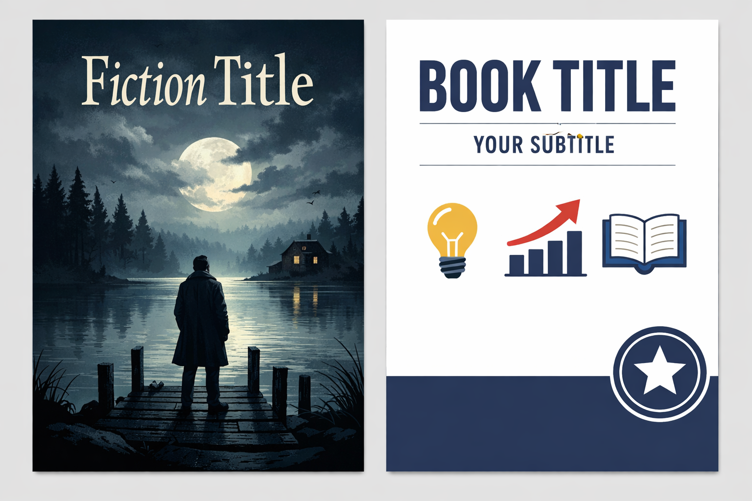
Why the difference matters (and the angle this article covers)
Fiction and nonfiction covers aren’t just different styles — they serve different decision moments for readers. Fiction attracts with mood, promise of story and genre cues. Nonfiction has to promise a result, establish credibility, and make a practical value proposition quickly.
This article focuses on a practical, under‑covered angle: how to translate a single cover concept between fiction and nonfiction goals without rebuilding from scratch. If you plan to publish multiple editions (memoir vs novelized version), spin an idea from a series into a craft book, or simply want to choose the right visual approach for your book type, this workflow and checklist will help you make defensible, market‑aware design choices.
Core differences in reader decision-making
- Fiction: Readers choose on feeling, genre recognition, and a promise of experience. Covers should quickly communicate genre (thriller, romance, lit‑fic), tone (dark, whimsical), and intrigue.
- Nonfiction: Readers choose on benefit, credibility, and clarity. Covers must say what the book delivers, who it’s for, and why the author (or method) is trustworthy.
How those decisions translate into design choices
Below are the main visual axes where fiction and nonfiction covers tend to diverge, with actionable tips for each.
1. Focal element: image vs typography
Fiction covers often centre on an evocative image or illustration that conveys mood or setting. Nonfiction covers more frequently prioritise typography and clear messaging (title + subtitle) as the primary visual anchor.
- Practical tip: If your initial concept relies on a single evocative photo, test a typography‑first variant with the same color palette and a tightened title treatment. This keeps the visual identity while switching the emphasis to benefit and clarity.
2. Title, subtitle, and author name hierarchy
Nonfiction regularly includes a subtitle that explains the promise (how, who, outcome). That subtitle becomes a major design element and changes layout decisions.
- Nonfiction: Title then subtitle; subtitle often sits visibly on the front, sometimes at 25–40% of the title’s weight.
- Fiction: Title gets centre stage; subtitling is rare and usually smaller or absent.
For practical rules about arranging title, subtitle and author name that work at thumbnail sizes, see our guide on Book Cover Typography Hierarchy.
3. Imagery choices: literal vs symbolic
Fiction imagery can be ambiguous and symbolic — a fragment of a scene, a character silhouette, mood lighting. Nonfiction imagery should avoid ambiguity when the visual competes with clarity about content; real people, process photos, or icons that suggest utility are common.
- Practical tip: If using a photograph on nonfiction, prefer an image that communicates outcome (a before/after, a confident person, a clear object) rather than an abstract scene that requires interpretation.
4. Color and genre signalling
Color means different things depending on genre and expectations. While color testing is always advisable, genre conventions should inform your starting palette.
See our guide on Choosing Book Cover Colors That Match Genre Expectations for a deeper look at how color plays with audience expectations and how to test color variants effectively.
5. Use of endorsements, badges and credentials
Nonfiction covers often feature endorsements, credentials, blurbs, or organisational logos to build trust. These elements must be integrated without cluttering the visual flow. Fiction occasionally uses blurbs, but these are usually kept to the back cover or a small front‑cover strip.
6. Back cover and spine priorities
Nonfiction back covers are content‑heavy: blurb, benefits, author bio, credentials, table of contents, or call‑to‑action. Fiction back covers usually feature a short hook, quote or review and author bio.
Spine rules shift as well: nonfiction spines frequently foreground the author name (especially for business or self‑help), while fiction often prioritises the title or series branding. For spine type sizes and layout tips for paperback shelving and thumbnail readability see our Book Spine Typography and Readability for Paperback Authors guide.
Thumbnail and discoverability tradeoffs
Both genres compete in thumbnail‑first marketplaces (Amazon, Apple Books, Audible). The tradeoff: a dramatic, image‑heavy design can look great large but fail at thumbnail; a strong typographic solution can remain legible across sizes.
Before you commit to a final cover, run the thumbnail checks described in our How to Test Whether a Book Cover Works at Thumbnail Size article. When adapting a fiction concept to nonfiction, you’ll often need to increase title weight and simplify background details so the subtitle and promise remain legible at 60–120px wide.
Practical adaptation workflow: convert one concept across genres
Here is a repeatable, 9‑step workflow for adapting a single cover concept between fiction and nonfiction goals without starting over.
- Define the decision moment — Ask: what must a viewer know in 1 second? For fiction: genre/tone. For nonfiction: benefit and audience.
- Lock the palette — Use the same or related color palette to preserve identity, then tweak saturation/contrast to match expectations (darker for noir, brighter for self‑help).
- Rebalance hierarchy — Make title/subtitle/author weight changes. For nonfiction increase subtitle prominence; for fiction often increase title prominence and tone cues.
- Swap imagery where necessary — Replace ambiguous symbolism with clear outcome images for nonfiction, or replace literal photos with stylised illustrations for fiction when you want more mood.
- Add or remove trust signals — Nonfiction may need credentials, endorsements, or institution logos. Place these low on the front or on the back to avoid visual noise.
- Clean for thumbnails — Remove small ornaments and reduce typefaces. Increase letter spacing and font weight to preserve legibility on small screens.
- Rework back cover copy — Nonfiction: benefits, bullets, author credentials, call‑to‑action. Fiction: hook, short praise, author bio.
- Test and iterate — Produce 3–5 variants and run thumbnail tests, genre‑fit checks, and a basic heatmap review (focus points, eye path).
- Preflight for print — Ensure spine width, bleed, and barcode space are correct for your trim and page count. Use a print cover calculator or templates to verify final dimensions.
Checklist: quick dos and don’ts when switching genres
- Do use a subtitle on nonfiction to clarify outcome.
- Do test titles and author‑name prominence at thumbnail sizes.
- Do simplify complex illustrations or photos for small sizes.
- Don’t pack endorsements on the front of fiction covers — reserve front space for a single strong visual cue.
- Don’t use decorative scripts for nonfiction titles that must be read quickly in a marketplace grid.
Common mistakes authors make when converting a concept
Awareness of these traps will save redesign time:
- Keeping the wrong focal point: A moody landscape that hints at theme may work for a novel but leaves nonfiction readers unsure about the book’s benefit.
- Forgetting the subtitle: Authors sometimes omit or hide the subtitle in nonfiction because it upsets an original composition; the subtitle is often the thing that converts nonfiction readers.
- Cluttering with credentials: Adding too many logos or badges on the front to prove credibility can reduce clarity. Choose one or two trust signals and move others to the back.
- Neglecting the back cover: Nonfiction back covers are their landing pages — treat the back cover copy like a mini sales page, with bullets and a short author bio.
Practical examples (short, non‑prescriptive scenarios)
These micro examples show how one concept changes with intent.
- Memoir (nonfiction) adapted from a novel concept: Keep the photo or portrait, but add a descriptive subtitle and author credentials. Replace atmospheric vignette with a cleaner background and stronger title weight so the subtitle reads in thumbnails.
- Self‑help/workbook: Turn an illustration idea into a bold typographic cover with a strong promise line and bullets on the back. Use color to indicate approach (warm/neutrals for wellness; high contrast for business).
- Genre fiction: Emphasise mood with lighting and a single symbolic object; keep type treatment dramatic and leave detailed copy for the back cover.
Testing, feedback and iteration: a practical loop
Design decisions are hypotheses. Use the following inexpensive tests before finalising a cover:
- Thumbnail A/B test: Put two variants (typography‑first vs image‑first) through a quick peer or reader poll to see which communicates genre or benefit faster.
- Marketplace fit check: Compare your cover thumbnails against top 10 bestselling covers in the target genre; check for visual conformity and distinctiveness.
- Clarity test: Show the cover at 60px wide to three people and ask: “What is this book about?” If answers are inconsistent for nonfiction, simplify.
Production and file‑prep differences to remember
Whether you adapt for ebook, paperback or audiobook, production requirements are the same for both genres but the content you must prepare differs.
- Nonfiction requires tidy backcover copy and whitespace for barcodes, while fiction may prioritise full‑wrap artwork.
- Spine text choices change depending on author‑name prominence; test spine legibility using your page count and trim size when preparing a full‑wrap file.
- Always run a preflight checklist before upload: image resolution, bleed, safe margins and barcode space. Our Cover Checker: The Complete Preflight & Market‑Ready Checklist explains a practical routine you can run before publishing.
How Cover Studio AI fits this workflow
Cover Studio AI can speed iteration when you need multiple variants: generate image and typography options quickly, export printable templates, and retest thumbnails without rebuilding layouts by hand. Use front‑only covers for rapid thumbnail testing, then turn the selected concept into a full wrap for print using a print template.
If you’re preparing designs for KDP, our guides on printable templates and cover generators can help you move from a front concept to a properly sized full‑wrap PDF without layout errors.
Final checklist before you publish
- Does the cover communicate the main reader decision in 1–2 seconds? (genre mood vs practical benefit)
- Is the subtitle legible and meaningful for nonfiction? Does it explain the promise?
- Are trust signals used judiciously, not as decoration?
- Have you tested at thumbnail size and on different backgrounds (light/dark marketplace UI)?
- Is the back cover copy appropriate for the book type (sales / benefits for nonfiction; hook/reviews for fiction)?
- Have you preflighted the file for print and verified spine width for the chosen trim and page count?
Resources and further reading
For practical, hands‑on guidance that complements this article:
- Book Cover Typography Hierarchy: Practical Rules for Title, Subtitle, and Author Name — for detailed typographic rules that work at thumbnail scale.
- Choosing Book Cover Colors That Match Genre Expectations — to pick and test palettes that signal genre and audience.
- How to Test Whether a Book Cover Works at Thumbnail Size — a step‑by‑step protocol for thumbnail testing and iteration.
Designing a cover is part craft and part market signal. When you move a concept between fiction and nonfiction, the fastest path to a usable cover is a clear definition of what a reader needs to know immediately, followed by deliberate hierarchy and thumbnail testing. Use the workflow and checklist above to adapt with intention, not guesswork.