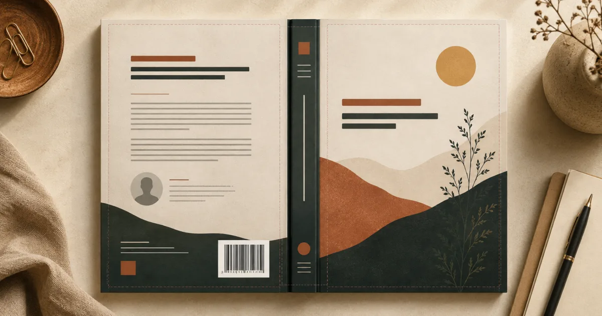
Authors often spend weeks refining the front cover, then treat the back as the place where leftover copy goes. That is a missed opportunity. The front earns a glance; the back helps a curious reader decide whether the book is worth their time.
A professional print cover also has a production job. In the flat file, the panels run back cover | spine | front cover. The back must hold readable marketing copy while staying clear of trim, folds, bleed, and the barcode area. This guide explains what to include, what to leave out, and how to arrange the pieces into a back cover that feels connected to the whole book.
What Goes on the Back Cover of a Book?
Most back covers combine a few of these elements:
- Book description or blurb: the main reason a reader keeps considering the book.
- Short author bio: useful when the author's expertise, background, or voice strengthens the promise.
- Author photo: appropriate for some nonfiction, memoir, business, and personality-led books, but optional.
- Review quote or testimonial: one strong, credible endorsement can add useful context.
- Publisher or imprint information: usually a small name or logo near the bottom.
- Website or social information: include only a stable, useful destination; a short domain is often better than several handles.
- ISBN and barcode area: quiet space reserved for a supplied or platform-added barcode.
- Background artwork: a continuation, coordinated texture, color field, or complementary image.
Not every book needs every item. A novel may use a hook, blurb, one quote, and barcode. A practical nonfiction book may replace the review with benefit bullets and a brief credential-led bio. An image-heavy art book may keep copy deliberately sparse. Choose elements because they help a reader or satisfy production needs—not because another cover happened to use them.
The Most Important Element: Your Book Blurb
The back cover blurb is not a plot summary, table of contents, or miniature introduction. It is focused sales copy that helps the right reader understand the experience or result the book offers.
A fiction blurb structure
Open with a hook that establishes the character, situation, or disruption. Introduce the central conflict and meaningful stakes without explaining every subplot. End by creating a question the reader wants the story to answer.
For example, the structure might be:
A cartographer who has never left her island discovers a coastline that should not exist. To prove the map is real, she must sail with the rival who ruined her family—before the approaching fleet erases both the island and its history.
That is original illustrative copy, not a blurb from a published novel. Notice the progression: character and anomaly, conflict and complication, then stakes and curiosity.
A nonfiction blurb structure
Begin with the reader's recognizable problem or desired change. State what the book helps them understand or do, then name a few concrete outcomes. Credentials can support the promise, but they should not overshadow it.
An illustrative structure might be:
You have useful research, but your reports keep getting skimmed. This guide shows you how to turn complex findings into clear decisions through stronger framing, practical charts, and concise recommendations. Learn a repeatable process you can use before your next stakeholder review.
Fiction sells tension and experience; nonfiction sells relevance and transformation. Both need specificity.
How long should it be?
There is no universal word count. As a practical starting range, many back-cover blurbs work at roughly 100–200 words, but genre, trim size, endorsements, and type size all affect the available space. Shorter is better than shrinking the text until it becomes tiring to read. Draft freely, then cut setup, repeated claims, names the reader does not need yet, and vague praise.
Use short paragraphs. Read the copy aloud. The hook should make sense without knowledge of the manuscript, and the final line should create momentum without resorting to empty superlatives.
Book Back Cover Layout
A reliable book back cover layout gives the most important message the most visual weight. One practical hierarchy is:
[Headline or hook]

[Book description]

[Optional review quote]

[Author bio / optional author photo]

[Publisher information]                 [Reserved barcode area]
This is a starting point, not a mandatory template. A nonfiction cover might place a promise-led headline above three benefit bullets. A novel might omit a separate headline and let the first sentence of the blurb do the work.
Keep the reading order obvious. Use size, weight, and spacing to distinguish the hook, body copy, endorsement, and attribution. Align related items to a common edge. Give the blurb a comfortable line length rather than stretching sentences from trim to trim.
Whitespace is functional. It separates ideas, improves comprehension, and protects the design from normal manufacturing variation. Keep every essential word inside the template's safe area. Background color or imagery can extend through bleed, but copy, logos, faces, and borders should not sit against a cut or fold line.
Contrast matters more than decoration. If artwork is active, place the copy over a naturally quiet region or use a restrained tonal field behind it. Test the page at actual print size; a back cover is held and read, so tiny typography is not rescued by looking elegant on a large monitor.
Where Does the Barcode Go?
The barcode normally occupies a reserved region near the bottom of the back cover. The exact placement and clear-space needs depend on the printer, distributor, template, and whether you supply the barcode or let the platform add it. Follow the current template for the specific edition rather than assuming one position is mandatory everywhere.
Plan for it early. Do not place a key sentence, author face, publisher logo, or important part of an illustration in the reserved zone. A quiet, high-contrast background makes later placement less disruptive. If the barcode is added during the publishing workflow, inspect the platform preview to make sure it does not collide with other elements.
Cover Studio AI's full-wrap editor shows the barcode area alongside the back, spine, front, bleed, and safe-area guides. That makes it possible to compose around the production space instead of discovering the conflict after export. For ISBN and barcode details, use the KDP barcode guide.
Should Artwork Continue Across the Spine and Back?
It can, but continuity is a creative choice rather than a requirement. Three approaches work well.
1. Full panoramic or wraparound artwork
A landscape, interior, sky, pattern, or atmospheric scene can travel across all three panels. This creates a premium sense of continuity and works especially well when the source was composed for a wide canvas. Keep faces, typography, buildings, and other recognizable details away from the spine folds and hardcover hinges.
2. A coordinated background derived from the front
Extend a color, texture, gradient, or low-detail portion of the front artwork across the spine and back. The edition feels unified, while the back remains calm enough for copy. This is often the most flexible option when the original front art is portrait-oriented.
3. A simpler complementary back cover
Use a solid color, subtle texture, or restrained graphic that shares the front's palette and typography. It does not need to repeat the front illustration. This approach is effective for nonfiction, minimal designs, and any cover whose front image cannot be extended convincingly.
The full-wrap book cover guide goes deeper into preparing continuous artwork. Cover Studio AI supports a complete back + spine + front artwork layer as well as coordinated panel designs, so the choice can follow the book rather than the limitations of a front-only canvas.
Designing the Spine With the Back Cover
The spine is the visual hinge between the two panels. It commonly carries the title, author name, and—when there is enough room—a small publisher mark. Keep the hierarchy simple, center elements within the true spine boundaries, and leave generous clearance from each fold.
Spine width depends on the final page count, paper, trim, binding, and current production specification. Finish the interior before locking the spine, then calculate it for that exact edition. Do not estimate from a similar book or resize a previous cover. The spine width calculator and KDP cover calculation guide cover the detailed inputs without repeating the arithmetic here.
Coordinate spine contrast with both neighboring panels. A dark strip can provide a clean bridge between two lighter panels; a continuous background can work when the spine text still reads clearly. Thin books may not support readable or platform-permitted spine text, so omission is better than forcing tiny lettering.
Paperback vs. Hardcover Back Covers
A paperback bends directly around the spine and is trimmed at the outer edges. Its back-cover plan centers on bleed, safe areas, barcode space, and the spine boundary.
A case-laminate hardcover also has hinge and case-wrap regions. Artwork may continue through them, but meaningful copy and details should stay on the safe board area because material bends or wraps around the structure. Dust-jacket hardcovers add flaps with their own editorial possibilities and printer specifications.
Do not scale a paperback design to make a hardcover. Create a format-specific canvas, preserve the visual system, and reposition each element for the new geometry. The book cover dimensions guide and KDP cover size guide explain those format differences in detail.
Common Book Back Cover Mistakes
- Too much text: an exhaustive synopsis creates a wall of copy. Edit for one clear promise and a few supporting details.
- Tiny typography: if the blurb only fits after aggressive shrinking, shorten it or remove a secondary element.
- Weak contrast: patterned or similarly toned backgrounds make reading difficult. Create a quiet field or move the copy.
- Crowding the barcode: reserving the space late can cover text or important art.
- Repeating the front unnecessarily: coordinated design is not the same as duplicating the title treatment and image at equal strength.
- Too many testimonials: one or two relevant endorsements are stronger than a dense stack of praise.
- Inconsistent visual style: unrelated fonts, colors, and image treatments make the back feel attached from another book.
- Designing before specifications are final: page-count or format changes alter the spine and overall canvas.
- Ignoring safe zones and bleed: essential content can be trimmed, folded, or wrapped out of view.
The broader common book cover mistakes guide includes front-cover, resolution, genre, and proofing checks as well.
Example Back Cover Workflow
- Finish the manuscript and interior. Proof it and export the final print file so the page count is stable.
- Determine the production specification. Confirm format, trim size, page count, paper, binding, and bleed.
- Calculate the full cover dimensions. Generate a current template rather than estimating the spine.
- Create or select the front artwork. Make sure it has enough resolution and a clear focal point.
- Extend or coordinate the artwork. Choose panoramic art, a derived background, or a complementary back panel.
- Add and edit the blurb. Build the hook and promise, then cut until it fits at a readable size.
- Add author and publisher information. Include only elements that support the reader or edition.
- Reserve the barcode area. Keep it free of important text and imagery.
- Check safe zones and bleed. Review the back, spine, and front separately and as a single wrap.
- Export the print-ready cover. Inspect the PDF at full size and use the publisher's preview before ordering a proof.
Book Back Cover Checklist
- The blurb opens with a specific hook or reader problem.
- The copy describes stakes, experience, or outcomes without summarizing the whole book.
- Body text is comfortable to read at actual print size.
- Headline, blurb, review, and bio have a clear hierarchy.
- Every included review is accurate, attributed, and permitted for use.
- The author bio is brief and relevant; the photo is high quality if included.
- Publisher and website information are current.
- The barcode region contains no essential words, faces, logos, or detailed art.
- Essential content stays inside safe areas.
- Backgrounds extend through required bleed or case-wrap regions.
- The back, spine, and front share a coherent visual system.
- The cover matches the final format, trim, paper, binding, and page count.
- The exported PDF contains no visible guides or placeholder content.
- The platform preview and a physical proof have been checked.
Create the Complete Cover, Not Just the Front
A polished self-published book back cover is easiest to build when it is part of the same document as the spine and front. Cover Studio AI lets you design the complete paperback or hardcover wrap, using calculated spine dimensions, bleed and safe-area guides, a visible barcode area, editable typography and layout, and print-ready PDF export.
You can upload your own artwork and use the manual design and export workflow without requiring an AI subscription. AI-assisted artwork is available when it suits the project, but it is not required to build a technically prepared cover.
Design your complete paperback or hardcover cover — front, spine, and back — with Cover Studio AI.
Frequently Asked Questions About Book Back Covers
What goes on the back cover of a book?
Most back covers include a concise book description, optional endorsement, brief author or publisher information, coordinated artwork, and space for an ISBN barcode. Include only the elements that help the reader or the production process.
How long should a back cover blurb be?
Many effective blurbs fall around 100–200 words, but there is no universal requirement. Use the length your trim size and hierarchy can support at a comfortable reading size.
Where should the barcode go on a book cover?
It commonly appears in a reserved area near the bottom of the back cover. Exact placement depends on the printer or publishing platform, so use the current template and keep important content out of its designated zone.
Does an author photo belong on the back cover?
Only when it serves the book. It can support memoir, business, practical nonfiction, or personality-led work, while many novels and minimalist covers are stronger without one.
Should the back cover use the same artwork as the front?
It should feel related, but it does not need to repeat the front. Use continuous panoramic art, a quieter extension of the front background, or a complementary color and texture system.
Do Kindle ebooks need a back cover?
No. A Kindle ebook listing uses a front-cover image. The back, spine, bleed, and barcode are features of physical print editions.
Can book artwork wrap around the spine and back?
Yes. Wide artwork can span the complete wrap when it has enough resolution and keeps important details away from folds, hinges, trim, copy, and the barcode area.
What should go on a nonfiction back cover?
Lead with the reader's problem and promised outcome, then add specific benefits, a short relevant author credential or bio, and credible endorsement if available. Keep production information and the barcode secondary.