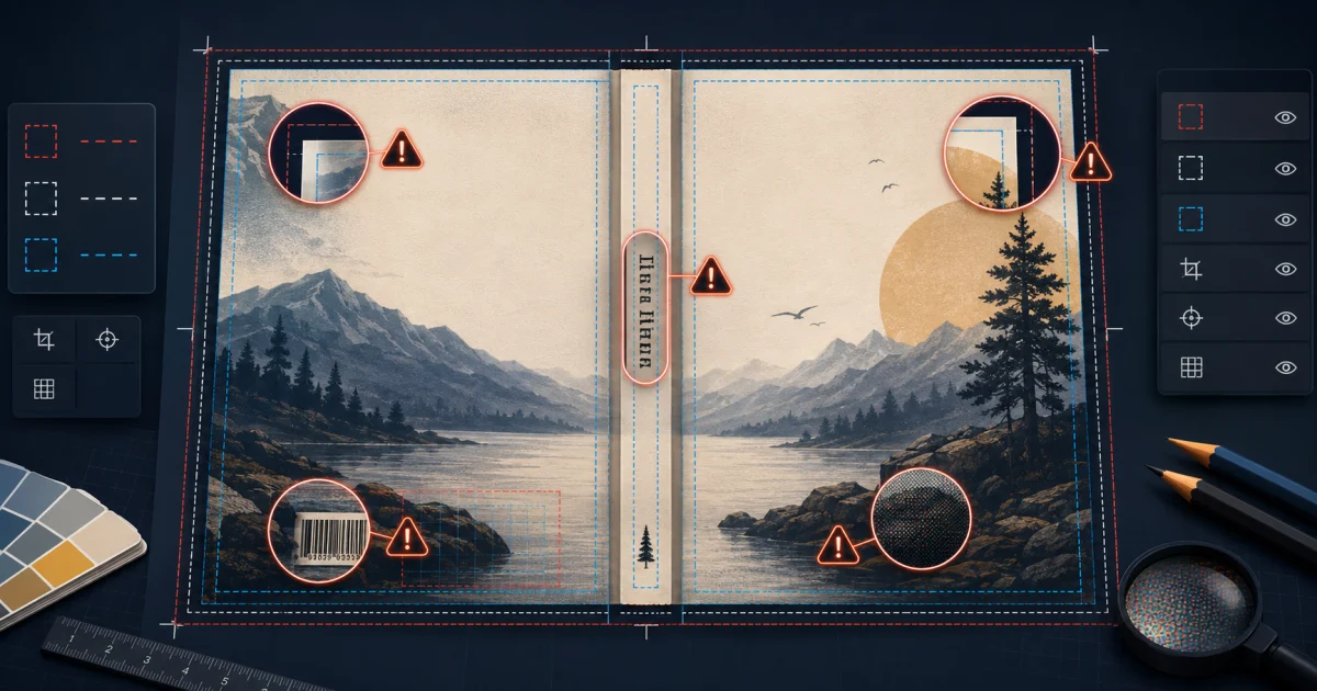
Most KDP cover mistakes begin before export. The author chooses a canvas from the trim size, estimates the spine, or adapts an ebook image for print. The artwork may look polished, yet the production file does not describe the book Amazon will manufacture.
This guide focuses on the 15 mistakes that affect Kindle, paperback, and hardcover covers. Each one separates a specification problem from a print-quality or design-quality risk, so you know what must be rebuilt and what deserves a visual improvement. For the underlying terminology, keep the Complete Book Cover Dimensions Guide nearby.
The 15 KDP Cover Mistakes at a Glance
| Mistake | Main risk | Best prevention |
|---|---|---|
| Using trim size as the canvas | Wrong print-file dimensions | Calculate the complete wrap |
| Omitting back cover or spine | Incomplete print cover | Build back + spine + front |
| Designing before pagination is final | Obsolete spine and wrap | Finalize the interior first |
| Using the wrong spine width | Shifted panel boundaries | Calculate from exact specifications |
| Forgetting bleed | Exposed white edges near trim | Extend backgrounds beyond trim |
| Ignoring safe areas | Content enters uncertain production zones | Follow the current template |
| Placing text near trim | Visually cramped or vulnerable type | Add deliberate clearance |
| Forcing text onto a narrow spine | Unreadable or unsuitable spine | Omit or simplify spine text |
| Covering the barcode area | Barcode obscures the design | Reserve a quiet back-cover region |
| Using low-resolution artwork | Soft or pixelated print | Check effective resolution |
| Stretching a small image | Visible artifacts | Replace, recrop, or regenerate it |
| Reusing the Kindle file for print | Missing print geometry | Create a separate full wrap |
| Reusing paperback dimensions for hardcover | Wrong construction allowances | Use a hardcover-specific template |
| Ignoring thumbnail readability | Weak storefront communication | Test the cover small |
| Exporting the wrong file | Upload or output problems | Preflight the final deliverable |
1. Treating Trim Size as the Complete Cover Size
Trim size is the finished size of one page, and therefore approximately the visible front panel. It is not the full book cover size for a printed edition. The mistake happens because “6 × 9 book” sounds like a 6 × 9 cover, especially inside general graphic-design software.
A paperback canvas must include the back, spine, front, and bleed. A 6 × 9 file describes only one trimmed panel, so it is an actual dimensional problem rather than a matter of taste. Start from the edition’s complete measurements. The Amazon KDP Cover Size Guide explains how trim relates to the final file.
2. Forgetting That Print Covers Need Front, Spine, and Back
A Kindle cover is front-only, but KDP paperback and case-laminate hardcover covers are uploaded as a single book cover spread. Authors often begin with front art and discover late that the composition has no room for a spine, blurb, author information, or barcode.
Submitting a front-only image for a print edition is a specification mismatch. Plan the continuous wrap before commissioning or generating artwork: back on the left, spine in the center, and front on the right for a standard left-to-right book. Our full-wrap cover guide walks through that layout.
3. Calculating the Cover Before the Final Page Count
Page count determines the thickness of the print book. It can change when you alter trim, type size, margins, line spacing, illustrations, or chapter starts. Designing against a draft page count therefore creates a spine and total width that may become obsolete.
KDP’s preview may reveal a size mismatch or shifted guides, but even a small change can create a visible alignment problem in print. Export the final interior first, use its actual page count, and then calculate the cover. Recalculate after every pagination change; do not stretch the old file to fit.
4. Using the Wrong Spine Width
Spine width is not based on page count alone. Binding, paper or interior type, and the printer’s current production formula matter. A remembered formula, a template from another edition, or a measurement from a physical copy can all produce the wrong result.
An incorrect spine changes total width and moves both panel boundaries. Spine text may wrap toward the front or back even when the artwork technically uploads. Use the KDP Cover Sizes and Spine Width Calculator Guide, or enter the exact edition in the free KDP spine width calculator.
5. Forgetting Bleed
Bleed is artwork that extends beyond the trim line so normal cutting variation does not expose an unprinted sliver. This mistake occurs when the canvas stops at the finished panel edge or when an image is placed only up to the trim guide.
Missing required bleed is a production-file problem. A background that only barely reaches trim is also a print-quality risk because a small shift becomes conspicuous. Choose the correct bleed setting for the interior and cover, then extend every background color, texture, and edge-to-edge image through the full bleed region. Keep text out of that extension.
6. Putting Important Content Outside Safe Areas
Safe areas protect titles, author names, faces, logos, and other essential elements from trim, folds, hinges, and wrap regions. Authors sometimes mistake bleed for usable design space or hide the template before checking every panel.
Content outside a safe area is not automatically missing from every printed copy, but its placement is risky. On a hardcover, hinge and wrap geometry makes this especially important. Keep essential content inside the template’s recommended zones and allow extra breathing room when the design uses thin borders or precise symmetry. See the Amazon KDP Book Cover Templates guide for a guide-by-guide explanation.
7. Putting Text Too Close to Trim
Text can remain technically inside a safe zone and still feel uncomfortably close to the finished edge. The cause is usually designing while zoomed in, treating the safety line as a target, or enlarging the title after the composition is established.
This is often a design-quality problem before it becomes a production risk. A close cut makes type feel accidental, and ordinary trim variation can amplify the effect. Judge the cover at actual size, add intentional clearance on all sides, and avoid frames or baselines whose success depends on a perfectly centered cut.
8. Designing a Spine Too Narrow for Readable Text
Not every book benefits from spine text. On a thin paperback, authors may compress the title, use a tiny font, or reduce clearance until letters nearly touch both edges. KDP also applies format-specific eligibility and clearance rules for spine text.
Forcing type into an unsuitable spine can create a specification issue; type that merely fits but cannot be read is a design failure. Check the current template and KDP guidance for the edition. If the safe spine is too narrow, omit the text. A blank, intentional spine looks more professional than cramped lettering that drifts around the fold.
9. Covering the Barcode Area
If you do not supply an eligible barcode, KDP can place one on the back cover. A common mistake is positioning a blurb, logo, face, or detailed focal point inside the template’s reserved barcode region because the design is reviewed without the guide visible.
The cover may still be processed, but the added barcode can obscure important content or become hard to read against busy art. Decide early whether the workflow will use an author-supplied barcode or platform placement. In either case, preserve a quiet, high-contrast area and verify the result in the previewer. The book back-cover guide has a practical panel layout.
10. Using Low-Resolution Artwork
An image can look sharp while displayed small and still lack enough pixels at its final printed size. Web downloads, compressed previews, screenshots, and tightly cropped source images are common causes. The relevant number is effective resolution after placement, not a DPI label typed into file metadata.
Low resolution is generally a print-quality problem: the cover may reproduce with softness, jagged edges, or visible pixels. Check the placed image at its final physical dimensions and inspect the export at 100 percent. Aim for the resolution required by the current KDP specification; changing 72 to 300 in metadata does not create detail. Use the book cover measurements and image-quality guide for pixel planning.
11. Stretching or Upscaling a Small Image
Upscaling changes pixel dimensions, but aggressive enlargement cannot recover texture, clean edges, or fine detail that the source never contained. Stretching is worse: it changes the image’s proportions and can make people, objects, and typography look subtly distorted.
This usually causes a quality problem rather than a dimensional rejection. Replace the source with a larger original, choose a crop that requires less enlargement, or regenerate the artwork at the intended aspect ratio. If modest upscaling is unavoidable, use a high-quality method once and inspect faces, edges, gradients, and fine patterns at full size.
12. Using the Kindle Cover File as the Paperback Cover
A Kindle cover is a portrait front image. A paperback cover is a measured print wrap with a back, spine, front, and bleed. The files may share artwork, type, and branding, but they are different deliverables.
Dropping the Kindle JPEG onto a wide print canvas often creates awkward empty space, severe cropping, or a visibly stretched background. Uploading it directly cannot provide the required print geometry. Return to the editable source, extend or recompose the artwork for the full spread, and keep back and spine text editable. For ebook output, follow the Kindle cover maker workflow and use the dedicated Kindle cover generator; for print, start with the paperback cover generator.
13. Using Paperback Dimensions for Hardcover
Paperback and hardcover covers are not interchangeable even when the interior trim and page count match. A case-laminate hardcover includes board, hinge, spine, and outer wrap regions that a paperback template does not describe.
Scaling a paperback PDF to the hardcover’s outer dimensions does not repair the internal geometry. It merely scales the artwork and type while leaving important elements in the wrong relationship to hinges and boards. Create a separate edition using the hardcover cover calculator, then adapt the visual system to its format-specific template.
14. Making the Title Unreadable as an Amazon Thumbnail
A technically perfect cover can still fail its first design job: communicating in a crowded storefront. Thin type, low contrast, long subtitles, and overly detailed artwork often look impressive at editor size but collapse when reduced.
This is a design-quality problem, not normally an upload specification. Test the front cover at roughly 100 to 250 pixels wide and beside comparable books. The main title and focal idea should survive even if small supporting copy does not. Strengthen value contrast, simplify the composition, or enlarge the title instead of adding more effects.
15. Exporting the Wrong File Format or Dimensions
The last mistake is assuming the design document and exported file are identical. Export presets can crop bleed, resize pixels, add marks, retain a visible template, rasterize text poorly, or produce the wrong color/file type for the edition.
Some export errors are true specification mismatches; others reduce print quality. Check KDP’s current requirements rather than relying on an old preset. Open the exported deliverable in a separate viewer, confirm its page count and physical or pixel dimensions, inspect every edge at 100 percent, and verify that guides and template labels are gone. Then use KDP Previewer and resolve meaningful warnings before ordering a physical proof.
A Practical KDP Cover Preflight
Before upload, confirm the following in order:
- The print interior is final and its page count matches the project.
- Format, trim, paper or interior type, bleed, and reading direction are correct.
- The KDP cover calculator result and template were generated for this exact edition.
- The print file contains the complete back-spine-front spread.
- Background artwork reaches through bleed; essential content remains inside safe areas.
- Spine text is permitted, readable, centered, and clear of its boundaries.
- The barcode region is free of essential copy and imagery.
- Artwork has sufficient effective resolution without distortion.
- Kindle, paperback, and hardcover each have format-specific files.
- The front remains clear at thumbnail size.
- The final export has been opened, proofread, previewed, and checked at full size.
For a worked measurement sequence, read How to Calculate KDP Book Cover Size. For help using an overlay without printing it accidentally, see KDP Cover Templates Explained.
How a Format-Aware Book Cover Creator Helps
General graphic-design software gives you a blank canvas. That flexibility is useful, but it also leaves you responsible for translating page count, binding, trim, paper, bleed, and current production rules into accurate geometry.
Cover Studio AI begins with the book’s production specifications. Its book cover creator can calculate the working layout for Kindle, paperback, or hardcover, show format-specific guides, and keep front, spine, and back elements editable. That reduces manual arithmetic and transcription mistakes; it does not replace proofreading, visual judgment, the KDP previewer, or a physical proof.
When the interior is final, create a properly sized cover with Cover Studio AI instead of rebuilding the complete wrap by hand.
Frequently Asked Questions About Book Cover Mistakes
What are the most common KDP cover mistakes?
The most consequential KDP cover mistakes are using trim size as the complete canvas, calculating before page count is final, choosing the wrong spine, omitting bleed, ignoring safe areas, and exporting a file for the wrong format. Low-resolution art and weak thumbnail readability may not be dimensional errors, but they can make the finished book look less professional. For novels, the fiction book cover design guide adds a focused review of genre signals, concept development, and reader expectations.
Can I use my Kindle cover for a paperback?
You can reuse the creative concept and source artwork, but not the same production file. A Kindle cover is front-only. A paperback needs one calculated PDF containing the back, spine, front, and bleed. Recompose the art on a paperback-specific template rather than stretching the Kindle image.
Why is my KDP cover the wrong size?
Usually one or more inputs do not match the edition: trim, page count, paper or interior type, binding, bleed, or reading direction. Confirm the final interior first, regenerate the calculator result and template, and compare the exported PDF’s dimensions with those values.
Does page count affect book cover size?
Yes. Page count affects the spine width of a print book, which changes the total width of the cover spread and the position of the front and back panels. A change to pagination requires a new calculation and another layout check.
Does a KDP paperback need bleed?
If artwork or a background is intended to reach a trim edge, it must extend through the cover’s required bleed area. Interior bleed is a separate project setting. Use the current KDP template for the exact edition and do not place important text in the bleed region.
How do I know the correct spine width?
Use a current calculator or template with the final page count, paper or interior type, binding, trim, and reading direction. Do not copy a spine measurement from another edition. If any production input changes, calculate it again.
What resolution should book cover artwork be?
For print, prepare artwork to meet KDP’s current resolution requirement at its final placed size, commonly 300 pixels per inch. Check actual pixel dimensions after cropping and scaling. For Kindle, pixel dimensions and aspect ratio matter more than a nominal DPI metadata value.
Can I make a KDP cover without Photoshop?
Yes. You can combine KDP’s official calculator/template with another editor, or use a format-aware tool such as Cover Studio AI that builds production geometry into the workspace. Whatever tool you choose, inspect the export, use Previewer, and order a proof when print appearance matters.
Fix the Geometry Before the Decoration
The safest sequence is simple: finalize the interior, calculate the edition, design inside the correct template, and inspect the exported file. Solve specification problems first, then evaluate print quality and storefront readability.
That approach prevents a beautiful front cover from becoming the wrong print cover. It also makes future paperback, hardcover, and Kindle editions easier to manage because each file has a clear purpose and verified measurements.